
Industry
Health Care
Role
Designer
Design System

Background
Before this project, the organization—a large healthcare system with over 30,000 employees and 2,000–3,000 website pages—had no formal design system. Design work relied heavily on contract workers, and while a development library existed, designers had no centralized resources in UX tools like Figma or Adobe XD.
As one of the two founding UX designers, I helped build the system from scratch, iterating from a minimal MVP to a robust design system with 60–70 components, each with 20–30 variations for multiple screen sizes and sub-brands. Our primary users are designers and developers, with increasing adoption by writers, web teams, and other stakeholders. Inspirations included Material Design and other industry-standard systems

Objective
The design system aimed to:
Create a single source of truth for components, usable across six sub-brands and multiple screen sizes.
Establish a scalable, accessible, and consistent design language for designers and developers.
Streamline collaboration and reduce inefficiencies in creating, testing, and maintaining components.
Enable faster, more reliable page creation (~2-5× speed improvement).
Guiding principles: accessibility, scalability, consistency, and practical usability for cross-functional teams.
Process
Brand Definition & Strategy
Before designing the system, we needed to define the visual and experiential identity of OSF Healthcare. The existing website had inconsistencies and lacked warmth, so our goal was to create a brand that felt inviting, supportive, and reflective of the organization’s mission of care. kept coming back to that we wanted it to feel like a warm fuzzy blanket; comforting, nurturing, and approachable, while remaining clean and professional. Every design decision, from color palettes to typography to imagery, was made to communicate warmth, compassion, and trust.
Once the OSF Healthcare brand was established, we expanded the approach to other sub-brands such as the children’s hospital and nursing colleges. Each sub-brand developed its own identity while remaining interconnected with the main brand, ensuring cohesion across the broader system. This brand foundation became the guiding framework for all subsequent design system work, influencing component design, accessibility, and overall user experience.

Audit & Research
Building the design system was an iterative, research-driven journey. We began with a comprehensive audit of existing assets and workflows, identifying inconsistencies and gaps. Designers lacked centralized tools in Figma or Adobe XD, component specifications were unclear, and collaboration with development was fragmented. To guide our work, we examined other design systems like Google’s Material Design, adapting industry best practices to fit our organization’s scale and complexity.
MVP
The first phase focused on creating an MVP. We prioritized foundational elements and key atoms that developers needed most, making sure they were functional across six screen sizes. This initial version allowed us to validate core patterns and begin the collaborative process with developers.
System Growth
As the system matured, we expanded to a robust library of 60–70 components with 20–30 variations each. Every component went through iterative refinement: we tested them in real pages, gathered feedback from designers and developers, and worked closely with the web team to confirm technical feasibility. Each component was documented thoroughly, including usage rules and links to supporting research, ensuring transparency and consistency across the system.
Organizing the system hierarchically (foundations, atoms, components) made it intuitive for all stakeholders, from designers to writers to web teams. This structure reduced miscommunication, accelerated workflow, and established a trusted source of truth.

Defining the scope and goals for an evolving design system was one of the biggest challenges. Starting from zero, we had to balance immediate needs with long-term scalability. Communication with developers and web teams was another hurdle; early feedback was inconsistent, and urgency sometimes created friction.
Scaling complexity across six screen sizes, multiple sub-brands, and dozens of component variations required careful planning and iteration. Through this process, we learned that structured documentation, phased goals, and iterative validation with stakeholders are critical. Clear hierarchies, transparent decision-making, and cross-team collaboration ensure adoption and reduce conflicts.
Outcomes
The design system has had a measurable impact on efficiency, consistency, and collaboration. Page creation can now be completed approximately five times faster than before, and the system serves as the single source of truth for designers and developers, reducing disputes about outdated components.
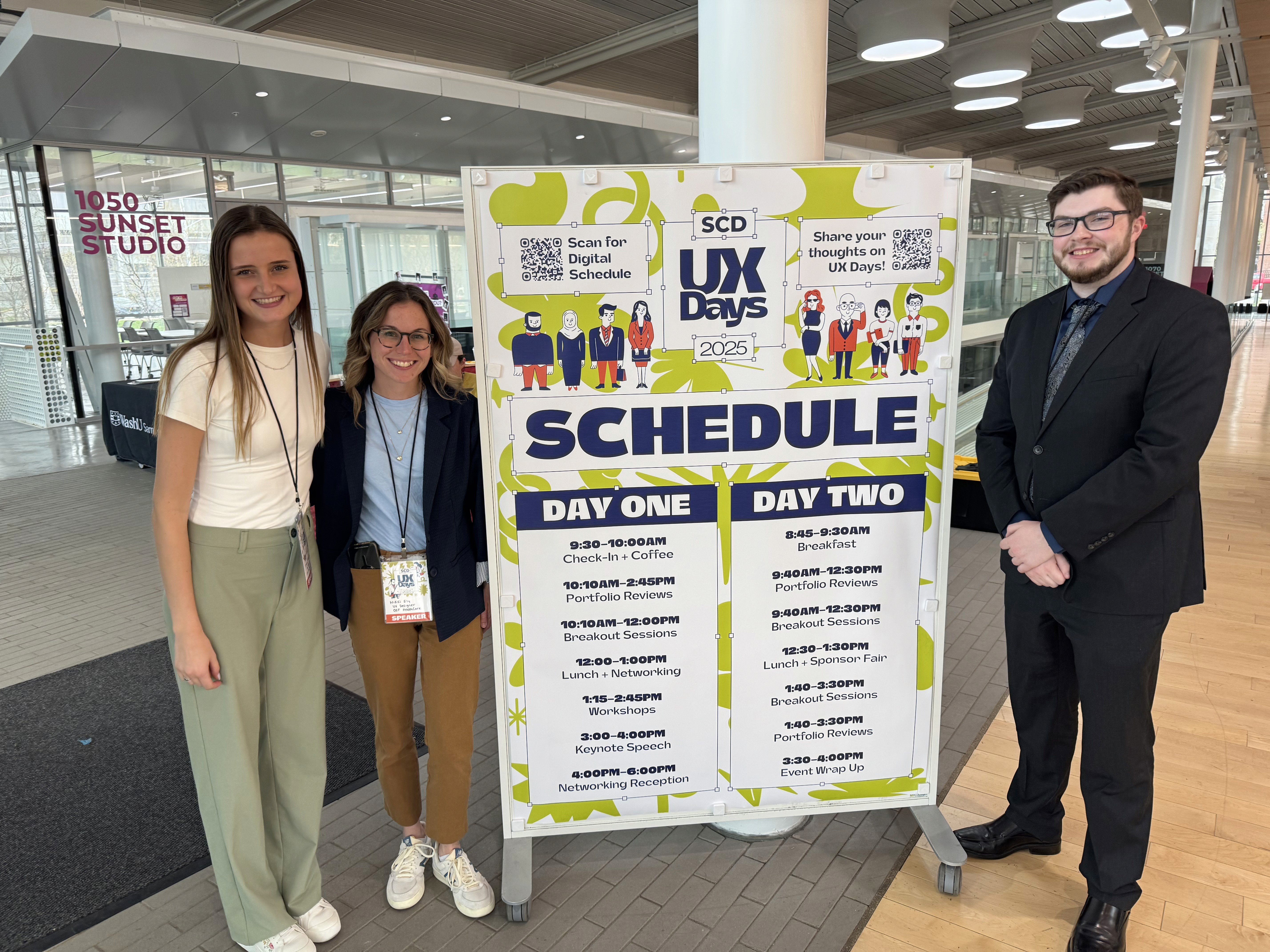
Adoption has expanded beyond design and development teams to include writers and web teams, creating a more informed and collaborative environment. We were able to chare how we created this design system by showcasing our methodology and thought leadership to the wider UX community at UX Days at UIUC.
Looking forward, the system is designed to evolve. Its modular structure allows us to continue adding components, expanding research integration, and scaling to meet future organizational needs while maintaining consistency and usability.