Industry
HealthCare
Role
OSF HeathCare Cancer Institute
Cancer Institute Project
The Cancer Institute website was outdated, fragmented, and difficult for patients, caregivers, and providers to navigate. The previous design lacked visual consistency, clear content hierarchy, and modern accessibility standards. With hundreds of pages of critical medical information, users struggled to find reliable resources quickly, and internal teams faced challenges maintaining content across the site. Our goal was to redesign the website to better serve patients and families while aligning with the Institute’s mission of compassionate care. The redesign needed to create a clear, approachable, and trustworthy experience, ensuring complex medical information was easy to access and understand. This project required balancing user needs with organizational requirements, accessibility standards, and the unique emotional context of cancer care.
Background
The Cancer Institute website was outdated, fragmented, and difficult for patients, caregivers, and providers to navigate. The previous design lacked visual consistency, clear content hierarchy, and modern accessibility standards. With hundreds of pages of critical medical information, users struggled to find reliable resources quickly, and internal teams faced challenges maintaining content across the site. Our goal was to redesign the website to better serve patients and families while aligning with the Institute’s mission of compassionate care. The redesign needed to create a clear, approachable, and trustworthy experience, ensuring complex medical information was easy to access and understand. This project required balancing user needs with organizational requirements, accessibility standards, and the unique emotional context of cancer care.
Objective
As a major addition to the OSF Ministry and a regional hub for cancer care, the website needed to match the Institute’s elevated role by clearly communicating its purpose, services, and exceptional capabilities.
Our goal was to create a digital experience that mirrors the excellence of care delivered by OSF Mission Partners. Stakeholder input, web analytics, and industry best practices uncovered key challenges: confusing navigation, a homepage that lacked emotional impact, and messaging that didn’t adequately convey the Institute’s advanced offerings or the compassionate mission of OSF. Through a user-centered design (UCD) approach, we focused on addressing the real needs of individuals visiting the site—often during some of the most overwhelming moments of their lives.
Research Process
When approaching this redesign, I started by grounding myself in the emotional reality of individuals facing cancer. According to NIH research, emotions like sadness, worry, and guilt dominate immediately after diagnosis—long before feelings of hope emerge. That insight became a lens for every research decision: the site couldn’t just inform, it had to reassure.
Secondary Research
I began by combining several data sources to understand where the current site was failing. Siteimprove analytics showed high bounce rates and weak CTA engagement on key pages, while competitor reviews highlighted stronger emotional resonance on other cancer sites. Internally, stakeholders described navigation as confusing and the homepage as lacking impact. My thought process here was to look for convergence points: if analytics, stakeholder feedback, and best practices all pointed to the same pain points, those areas became top priorities for testing.
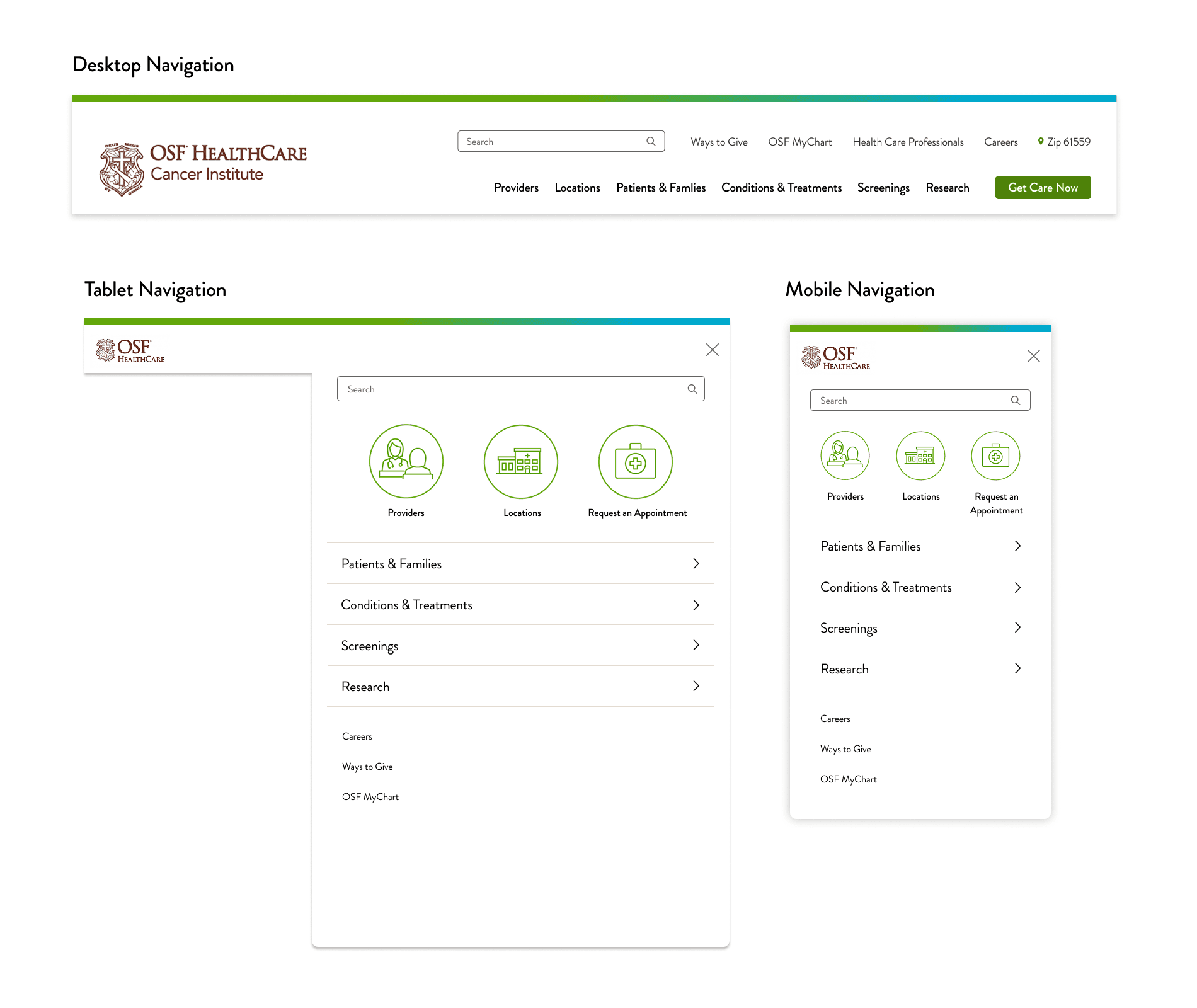
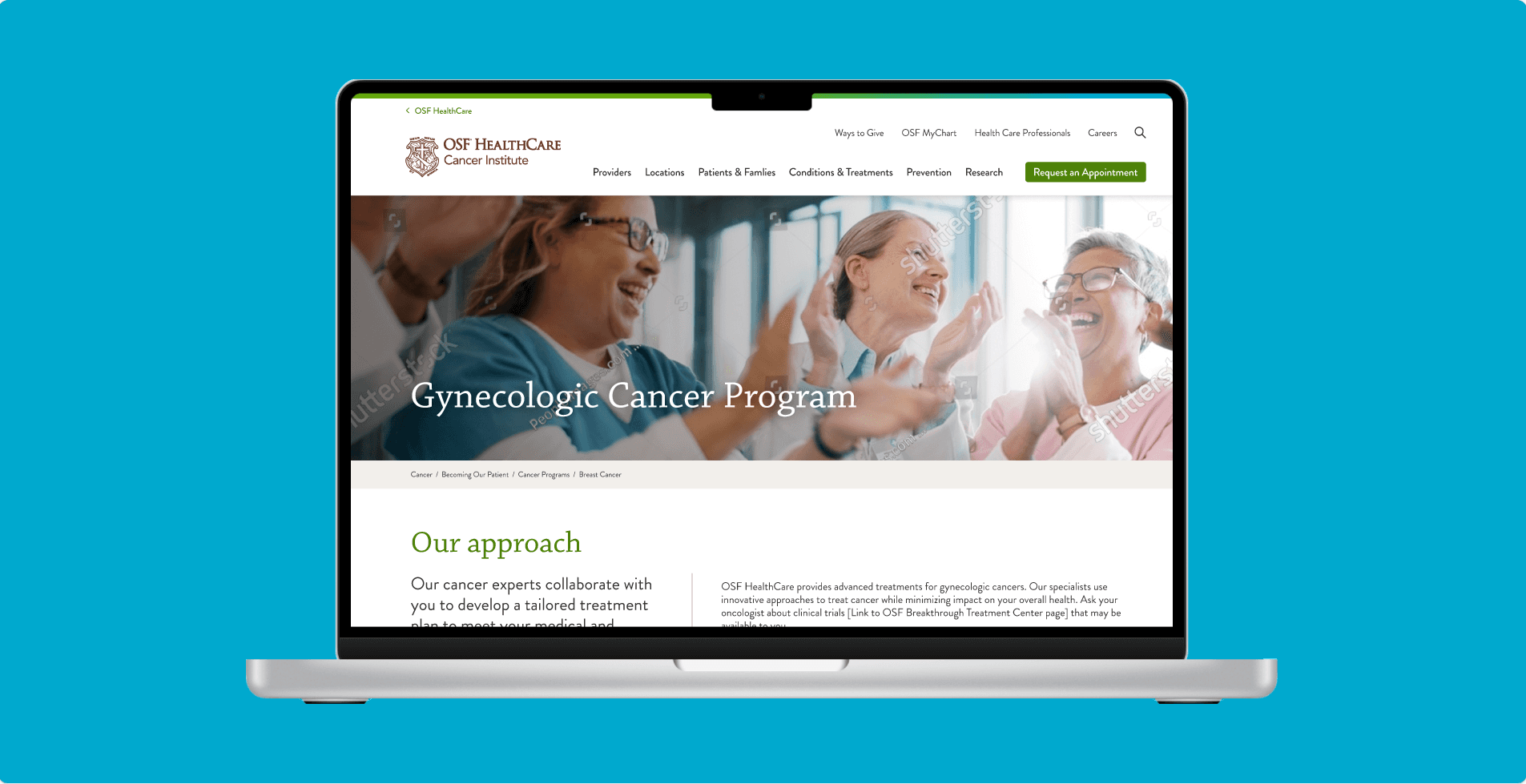
Test 1 – Navigation (Card Sorting)
Our main navigation was limited by space, so my first step was to clarify how users naturally expected content to be grouped. My research questions focused on problem areas we already suspected: Did people see clinical trials as research? Where would they put screenings? What did they think “programs” meant? And since we knew we’d need at least one new category, what should it be called?
I ran an unmoderated card sort on UserTesting.com, giving participants real terms from the site and asking them to sort and label them. While the data was mixed-method—primarily qualitative with some quantitative overlap—the key was looking for consistent mental models. I analyzed patterns in Excel and also paid close attention to participants’ proposed solutions.
The findings gave us clear direction:
“Clinical trials” belonged under “Research”
“Programs” were understood as treatments and fit better under “Conditions and Treatments”
Screenings and early detection content warranted a new category, “Prevention”
All other labels made sense and didn’t require major changes